Starting a Weekly Newsletter: Optimizations and Lessons Learned
Three months ago, I’ve started a new side-project called SoftwareLeadWeekly – a weekly email that I curate, packed with great leadership and management articles.
So far, I’ve sent 12 newsletters and collected A LOT of feedback regarding the website (where you can subscribe) and the email content my subscribers receive.
Some changes I made due to the feedback led to 24% higher click-through-rate while avoiding others helped me to see 15% higher conversion rate. Interesting eh?
Don’t try to immediately convince everyone you are trustworthy
When I’ve started with the newsletter, one of the comments I got from friends was “you need to explain your readers why they should trust you before they sign up. They don’t know you as much as we do”.
I was afraid that people wouldn’t believe me or believe that I could provide high quality content without convincing them first, so I’ve added my credibility to the top of the homepage. About a week after I launched it, I got an email from a one of my readers – “[…] got a recommendation about your site from a friend and I wanted to let you know I almost missed it. Your signup button was below the fold on my laptop and there was so much stuff going on. Just my 2c.”
Lesson Learned: I designed the page for the wrong type of visitors, aiming to convince visitors with low intent to subscribe instead of quickly allowing interested visitors to join me. I decided not to listen to my fears and let my content speak for itself. I’ve removed the section about myself, reduced the image size and moved the entire subscription-box to the middle of the page, way above the fold.
The results? 15% higher conversion rate!
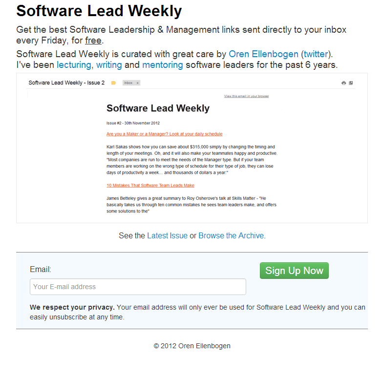
Before (left) and after (right):
Poor layout can kill even the greatest content
It took me some time to learn this lesson. The quality of the content I send is critical, yet, some people still missed it because it was hard to quickly scan through my email.
I started with a poorly designed email template: gray background color, different-size images, small fonts, poor use of spacing. It was painful to read. After talking with some of my readers, I decided to simplify the layout, aiming for quick scanning – I’ve removed the gray background, got rid of the images, increased the font-size, grouped articles by topics and used proper spacing so your eyes could easily jump from one article to another. One more trick I’ve used was adding the source of the article, just like Hacker News and Reddit do, next to each link to earn credibility and provide context.
Changing my content layout increased my click-through-rate by 24%.
Lesson Learned: optimize toward clarity even before optimizing for content. Otherwise, you’re investing in something that no one will see or read. It is just like having a confusing UI with wonderful technology underneath it. No one will care.
Before (left) and after (right):
Visualize your work
When I only started, I used my email to manage my weekly list, adding great articles during the week and then organizing it on Friday, before I published my newsletter. Even though it’s a pragmatic system, I found it be boring and unmanageable. Who wants that, right?
Having some experience with Trello, I decided to give it a try, simply because Trello has such a BEAUTIFUL layout that magically makes a list of articles into a collage of thoughts. With Trello, I enjoy looking back at previous issues I’ve sent. It fuels me to keep going, to push harder, to keep it beautiful and engaging.
Lesson Learned: using visualization to manage my work makes me happier. It’s a place I can take inspiration from, looking at previous articles I’ve sent or browse through the photos. It’s like looking at beautiful painting, made of your own work. You can check out the public Software Lead Weekly Trello board.
If you found this post helpful, I’d be humbled if you’d follow me on twitter (@orenellenbogen).


